We used to have it all.
Photo-Illustration: Vulture; Photo: Courtesy of the publisher
It’s hard to know what to look at first on the new all-in-one edition of Elena Ferrante’s Neapolitan quartet: the crowded first two sentences of My Brilliant Friend, the mishmash of serif and sans serif fonts, or the airbrush-style sprayed edges that depict the Gulf of Naples. The second this version was announced, people took to social media (and our book-related Slack channel) to complain about the design, annoyed about everything from the design to the edges to the #BookTokification of the series. The redesign is, frankly, ugly, and not even ugly in a good way.
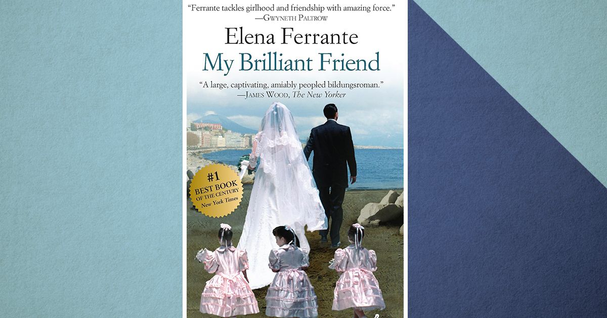
To complain about the ugliness of the new Ferrante cover is to acknowledge that the old Europa Editions were also ugly — but those were iconically ugly. My Brilliant Friend’s original cover — featuring the backs of a bride, a groom, and three little girls trailing behind them — both misrepresents that the book is mostly about children and boasts a soft, princessish aesthetic. Not to mention that when looking at those five figures, you might be thinking, Wait, who is the titular brilliant friend? In a day and age when book covers need to look good in order to be posted online, there are telltale signs of desperation in design: giant fonts, bright colors, gimmicks like sprayed edges. (I’m of the opinion that the only type of sprayed edges that ought to be considered acceptable are when fantasy novels have gold sprayed edges.) A number of book-cover tropes have set in as the publishing industry wobbles into an uncertain future: cartoony romance-novel covers, font-choice-as-design, an isolated part of a woman’s body abstracted to show she is complicated. Those trends are way past due. There is, however, a rare charm to a legitimately garish book, which is part and parcel of why the original Neapolitan novels are so iconic, and what makes the new one so … not. So, what is an acceptable type of ugly cover? Just look at the abandoned Ferrantes.
The original Neapolitan quartet had covers as though they were pulpy, paperback beach reads with a saccharine hue and little imagery to grasp onto. People clutching each other on the beach? That could mean anything. Is that mis-marketing? Not really — quite the opposite. The aloof art on the original books made it feel like literally anything could happen inside them. Possibilities galore! The new My Brilliant Friend cover already gives too much away: Lila, Don Achille. Why not just give away the ending while they’re at it!
Chic books have abstract cover designs — dots, squiggles, stars, oh my! — or perhaps a sample from a painting, but rarely do they have custom-made photorealistic images that remind you of a bad tattoo or Banksy. There is a distinctly corny quality to them that stands apart in a crowded, aesthetic-driven market, reminiscent of paperback romance novels or Hallmark movie posters. Part of what was always refreshing about reading Ferrante’s novels was looking back at the cover upon finishing the book and thinking that no character in the book looks anything like how the cover depicts them. The Neapolitan quartet’s original covers existed in a liminal space — neither exactly derived from the text but not out of nowhere — that made them memorable and awful all at once.
There are three pull quotes on My Brilliant Friend, including one from The New Yorker critic James Wood that calls the novel a “large, captivating, amiably peopled bildungsroman.” What? While this makes perfect sense, this can’t possibly be what will rope people in. The specificity and strangeness of this quote, paired with others that more or less say “yup, this is a masterpiece,” affirmed that these were books that were almost impossible to describe or depict at all. In order to enjoy them, you had to really go all in. The two opening sentences of My Brilliant Friend are not any more convincing a sell than the phrase “amiably peopled bildungsroman,” but only one of those options makes you wonder what could possibly be meant by “amiably peopled” in a book that’s mostly about Italian people arguing with one another.
There’s a reason why so many thrift stores are full of old Penguin editions of novels that have little beyond a title, author, and memorable logo: This is not overcomplicating things whatsoever, but rather making a book design straightforward, approachable, and clean. It’s also why there’s been such enthusiasm for Fitzcarraldo editions of books. This new Ferrante cover looks like it’s almost going for a Fitzcarraldo vibe — bluish color, typeface front and center — without the bravery to strip away the opening two sentences. Ferrante’s novels are so beloved at this point that her most die-hard fans would buy a copy without anything but the title — they already know they’re getting what they love.


